The Sustainable Development Goals (SDGs) are shaping global development, from how national policies and legislation are developed, how recipients of aid report their outcomes, to how all countries will report (and set baselines for) the state of their infrastructure, economy, and practically all elements relating to human development. From establishing the 17 Goals, 169 targets, and 232 indicators the inter-governmental discourse is now changing to how to monitor attainment of the SDGs. One facet of this is the technical one, on the 22nd to the 24th of January, the United Nations Statistics Division convened the National Platforms for SDG Reporting forum.
This convened countries, international organisations, and platform service providers to discuss differing approaches to monitoring the SDGs, technical implementations and innovations to discuss how to set recommendations and guidelines for such platforms. The outputs and presentations are all online too.
Given the nature of the forum, the data powering the platforms is drawn from National Statistical Offices and other data custodian agencies, as a component of their existing data collecting programs. For the inter-governmental process, this is essential – countries produce their own authoritative data and this will always be used as a primary source. But, what about secondary, complementary sources? This is compounded by methodological questions on how to analyse specific indicators.
For example, SDG Indicator 9.1.1 regards understanding the “Share of the rural population who live within 2 km of an all-season road”. Breaking this down:
How to differentiate between rural and urban populations – where do peri-urban areas lie?
How to calculate 2km from a road – is this in a straight line, what about geographic features, such as rivers and valleys?
How to define an “All season road”.
The question on urbanization/rural communities is a very common discussion, so I’ll leave it to one side. The last two points however do not have easy answers – and a lack of documented methodological guidance is severely hampering progression of the SDGs.
In many countries, road inventory is scant (see here), but there isn’t full GIS coverage of the road features, let alone an understanding of the quality. So, in effect, can we use what’s already out there, free and open data, to work out the SDGs?
So, in theory, sources like OpenStreetMap and WorldPop can already offer a level of insight that can assist with the methodological development of the goals. They could provide the data foundation for methodological development of the indicators and run in parallel with strengthening activities within the countries – ie. when the most aid dependent countries are capable of producing authoritative data for the indicators, technical platforms and methods will already exist to transform these data into actionable insights and drive data-driven policy development.
The SDGs should leave no-one behind and while attainment of the SDGs should be country-owned and country-led, what actions can the global commons take to work in parallel to support this agenda? An open test bed for SDG methodological analysis, modeled on OSM Analytics perhaps? Authoritative data and the choice of whether to use complementary/user generated/crowdsourced (etc etc) data will rest within the National Statistics/Mapping/Data Agency, there is an opportunity to develop the methods alongside this strengthening process – that way, when the agencies are strengthened, they’ll have a method to use for their indicators, targets, and goals.
—
*It’s using OpenStreetMap, OSM has a variety of sources, from crowdsourced data to imports. But… something’s there…!
The past three months have bought about a massive change, both personally and professionally. I’ve moved to New York, to take up a post within the United Nations’ Committee of Experts for Global Geospatial Information Management or UN-GGIM for short. Acronyms aside, it’s been a hard, but fun change with much challenging work ahead!
In moving from operational work (World Bank in Tanzania and with the N/LAB at the University of Nottingham) to a secretariat role, I’m hoping to bring a little field experience to Headquarters, especially in terms of supporting the development of policy and direction for geospatial data.
Looking back, I’m quite sad to to leave my previous colleagues behind, especially given the opportunity to build and lead the Tanzania Urban and Geospatial team from its inception – or to turn the phrase of my then boss Edward Anderson in 2011 “Build a mapping empire!”…
The 2017 World Bank’sPresident’s Innovation Award Winners (from left, Deogratias Minja, Edward Anderson, Justina Kajenge, Myself, and Freddie Mbuya)
From the pilot of mapping the Tandale neighbourhood in 2011 mapping ~65,000 people, Ramani Huria grew, from an initial start of 10 neighborhoods to scaling across Tanzania and supporting global projects like Missing Maps and national ones like Crowd2Map, while delivering its main mission of building flood resilience in Dar es Salaam. The Zanzibar Mapping Initiative has mapped Unguja Island at an unprecedented 3.5cm – 7cm resolution with Drones and laid a foundation for improved geospatial collaboration in Zanzibar. These innovative projects (and others) are now being mainstreamed into frontline operations through the Tanzania Urban Resilience Program – taking an innovation-led approach to capacity development operations, integrating innovation and research into projects, as opposed to leaving it as a footnote. Academically, surviving a PhD and helping bring the N/LAB Centre for International Analytics into being at the University of Nottingham are fond memories – bar the last few weeks of the PhD!
Ultimately, what has been the most rewarding has been the people, whether it has been Ward Officers in Tanzania; blue-sky scheming with Edward, Josh, and Samhir on the direction of the World Bank’s innovation work; being academically challenged with James, Gavin, and Andrew; Learning with the commons with Willow, Dirk, Giuseppe, Heather, Mikel, Florian, Sara, Tyler, Ivan and Nico; to being in the thick of one of the fastest growing cities in Africa with Msilikale, Deo, Beata, Devotha, Daud, Rashid, Roza, Darragh, and many others, too many to count. Thank you to you all – it was an honour.
Hopefully more Bernard than Sir Humphrey!
To win against the tide, though somethings never worked out (ie. jet ski lidar for inshore bathymetry!) friendships were made, and there was a little bit of love there too! Looking back at six years, 3 months on it really was a wonderful journey, here is to the next one. So, with that in mind, I am ex field ops, I have shuffled off mapping, ran down the scale bar and joined the international civil service in a secretariat – in time, leaning towards more Bernard than Sir Humphrey!
Over the past few weeks, I’ve managed to escape the office and get back to the field. With an impending change, it’s been a very refreshing time to get back into the mix – especially out onto the roads of Zanzibar.
Alongside work with scaling out Ramani Huria and working with (awesome!) colleagues on the signing of an Memorandum of Understanding between Ardhi University, World Bank, and DfID to support the development of curriculum (with ITC Twente) and the sustainability of community mapping in Tanzania for the next five years. I’ve been working on a side project to look at how machine learning can be used to assess road quality.
To do this, the N/LAB team at University of Nottingham and Spatial Info (the spin out of my team that helped build Ramani Huria/Tanzania Open Data Initiative) and I are working with the Zanzibari Department of Roads, under the Ministry of Infrastructure, Communications and Transport to survey all roads in Ugunja Island Zanzibar.
The Department of Roads & Uni Nottingham Team
So far, we’ve worked on getting a surveying vehicle back on the road, initial back and forth with government stakeholders, and working on pulling together the various road data sources (such those from the Government and OpenStreetMap) to work out where to drive and the sequencing of the survey. All of this will support a data collection protocol that merges traditional surveying techniques, with novel ones such as RoadLab Pro.
All of these data streams will then be used as a training dataset to see how machine learning can inform on road quality. But first, we’re getting the traditional survey underway. It’s going to be long road ahead – as long as all the roads in Zanzibar!
I’ve been playing around with the full planet file to look at going back in time in OSM. Mainly, this is to look at how Ramani Huria’s data has evolved over time and is all part of extracting more value from Ramani Huria’s data.
I’ve been playing around with the full planet file to look at going back in time in OSM. Mainly, this is to look at how Ramani Huria’s data has evolved over time and is all part of extracting more value from Ramani Huria’s data. This process wasn’t as straightforward as I had hoped, but eventually got there – also, this isn’t to say that this is the only or best way. It’s the one that worked for me!
To do this, you’ll need a pretty hefty machine – I’ve used a Lenovo x230 Intel i5 quad core 2.6ghz, 16gb of ram with over 500gb of free space – This is to deal with the large size of the files that you’ll be downloading. This is all running on Ubuntu 16.04.
Firstly, download the OSM Full History file. I used the uGet download manager to deal with the 10 hour download of a 60gb+ file over 10meg UK broadband connection. Leaving it overnight, I had a full file downloaded and ready for use. Now to set up the machine environment.
The stack is a combination of OSMIUM and OSMconvert. On paper, the OSMIUM tool should be the only tool needed. However, for reasons that I’ll come to, it didn’t work, so I found a workaround.
OSMconvert is easily installed:
sudo apt-get install osmctools
This installs OSMconvert other useful OSM manipulation tools. Installing OSMIUM is slightly more complicated and needs to be done through compiling by source.
Firstly, install LibOSMIUM – I found not installing the header files meant that compilation of OSMIUM proper would fail. Then use the OSMIUM docs to install OSMIUM. While there is a package included in Ubuntu for OSMIUM, it’s of a previous version which doesn’t allow the splitting of data by a timeframe. Now things should be set up and ready for pulling data out.
Dar es Salaam being the city of interest, has the bounding box (38.9813,-7.2,39.65,-6.45) – you’d replace these with the South West, North West point coordinates of your place of interest, and use OSMconvert, in the form:
This clips the full history file to that bounding box. It will take a bit of time. Now we can use OSMIUM to pull out the data from a date of our choice in the form:
This will be a different FOSS4G. As the first in a developing country, our vision is for an accessible and inclusive FOSS4G, a FOSS4G for All.
In 2013 I was fortunate to be on the Local Organizing Committee (LOC) of OSGEO’s Free and Open Source For Geospatial Annual Conference – aka FOSS4G. Each year, the location of FOSS4G is decided on the basis of Europe, North America and “Rest of the World”.
This will be a different FOSS4G. As the first in a developing country, our vision is for an accessible and inclusive FOSS4G, a FOSS4G for All.
In aligning FOSS4G 2018 within the Sustainable Development Agenda, we aim to complement the existing OSGeo stable while empowering the Open Data, Participatory Mapping and Internet of Things work currently underway within Tanzania, the region and worldwide. This will expand the scope of the conference from traditional geography and location tech, to applications, use and best practices of our tools.
Location and geography are at the heart of the Sustainable Development Goals: FOSS4G 2018 in Dar es Salaam would invigorate our existing projects, bringing them to new users and developers while supporting and nurturing the existing OSGeo community.
The clock has started for the LOC to organise the conference and the press release from OSGeo is out! It’s going to be a few months till FOSS4G 2017 in Boston till Msilikale, our LOC and I will pick up the keys to the FOSS4G car. In the meantime the Dar LOC will assemble and start laying the groundwork for 2018. It’s going to be a long and rewarding road ahead!
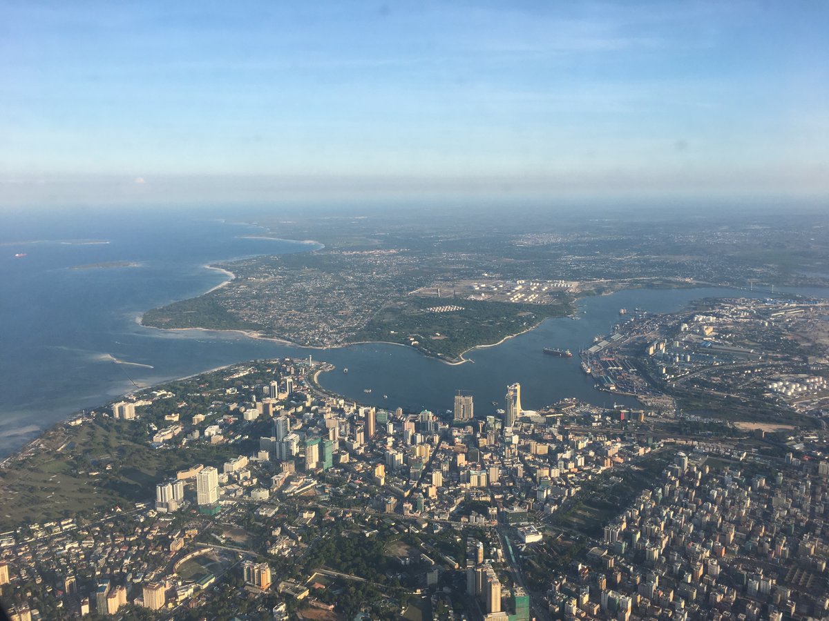
I first went to Dar es Salaam in 2011, there were a few skyscrapers adorning the city’s skyline, now they’re everywhere! Sitting on a rooftop bar in the center of the city, it’s a mass of cranes and pristine new buildings.
Alongside this rapid growth, Ramani Huria has been collecting a lot of data but a lot of it doesn’t get rendered by the default OSM styles… so I’ve dug into the data and created a map of the different floors across the city.
This interactive map allows you to explore where the tallest buildings are in the city, but in displaying the data in this way, also allows for the densest, unplanned and informal areas of the city to become very clear.
There is still some way to go though – in Dar es Salaam there are around 750,000 buildings, with roughly 220,000 (~30%) having been surveyed by the Ramani Huria team and given an appropriate attribute. Ramani Huria has focused its efforts in the urban centres of Dar es Salaam, where most of the multi-story buildings are to be found. But, still a lot more to be covered towards Bagomoyo and Morogoro.
Hat tip to Harry Wood who’s advice and guidance pointed me in the right direction – a more technical blog post and more details of other challenges around correctness of tagging but that’s for another post – now to look at Floor Spaces Indices…!
Due to a nodata tag issue within the GeoTiff standard, Pix4D doesn’t generate the nodata value in a GDAL compliant manner. As such, when importing GeoTiffs into software using GDAL (like QGIS or Mapbox) the nodata value is black, meaning overlapping layer issues. Additionally, for an unknown reason, Mapbox does not deal with multiple GeoTiffs in the same manner as it displays .mbtiles, pixellating uploaded GeoTiffs. This short blog presents a processing pipeline to deal with both of these issues.
Once you’ve got the nodata/transparency values resolved, it’s quite easy to add your Geotiffs to Mapbox’s Tilemill. Export your resulting map as .mbtiles and upload this to Mapbox as a tiles. In the Mapbox Studio Classic interface, add this to a map and voilà, a drone imagery online.
At the Africa Open Data Conference I was fortunate to have a chat with Juliana Letara, the Town Planner for Kinondoni Municipality and Osiligi Lossai, the Ward Executive Officer of Tandale. We discussed the recent community mapping, how they are beginning to use the maps and the data and some unexpected outcomes.
A longer blog will be incoming on how data is being used to support governance in Dar es Salaam. Personally, I’m still digesting some of the implications and potential of what they’re discussing, regarding the potential impact that Ramani Huria (also here http://ramanihuria.org) could have and is having in Dar es Salaam.
Four years ago, in August 2011 I was fortunate to manage the community mapping of Tandale. It was an experience that irrevocably changed my professional direction and interests. Over a month I trained and worked alongside brilliant students and community members, who were all focused on getting an open map of Tandale, something that had never been accomplished previously. When it was done, the reception across civil society and government was positive and intentions on scaling the pilot to the city were mooted but for one reason or another it never quite made it. Then in December, floods hit the city. In dense informal urban environments such as Tandale these floods are fatal and dramatically change the landscape as well as causing mass damage to survivor’s livelihoods and assets. Mitigating these floods are hard – where do you start in the fastest growing city in Africa? The population as of the 2012 census currently stands of 5 million, with projections showing it could grow to 10 million by 2030.
This rapid and unplanned urbanisation is in part the cause of flooding: the infrastructure with which to cope with high rainfall, such as drains and culverts, were not built alongside residential dwellings. This is especially acute in the unplanned, informal urban settlements where a majority of Dar es Salaam’s residents reside. The theory here is quite simple: If that if you can identify where it floods, you can either install or upgrade infrastructure to ameliorate the situation for residents. Unpacking this, the crux of the issue falls to two main points, governance and data.
Ramani Huria – Swahili for “Open Mapping” – is a operationalization of this theory of change. In March 2015, a coalition from across Tanzanian society, composed of the City Council of Dar es Salaam, the Tanzanian Commission for Science and Technology (COSTECH – under the Ministry of Science, Communication and Technology), the University of Dar es Salaam, Ardhi University, Buni Innovation Hub supported by the Red Cross and World Bank supported the inception of Ramani Huria, with the goal of mapping flood prone areas in Dar es Salaam, making this data openly available and supporting the use of this data into government where decisions can be made to mitigate flooding.
Mapping Phases
It is a far cry from 2011 where just mapping the ward of Tandale was a large task. Ramani Huria consists of a pilot phase and four subsequent phases. To pilot, the wards Ndugumbi, Tandale and Mchikichini, with a combined population of over 100,000 residents were mapped in series. This process combined 15 students matched with community members, leading to maps of all features within that community. This information, focusing on drainage and water ways, is critically needed to help understand and locate flood prone areas; this is high priority in Dar es Salaam due to the damage that annual floods wreak upon the city and its residents. In this piloting phase, conducted from March to the end of June these three wards were mapped, in part to generate the data that will generate flood inundation models and exposure layers but also to pilot the data model and gel the team, prior to Phase One.
Phase one on paper is quite simple. Take 150 students from the University of Dar es Salaam’s Department of Geography and Ardhi University’s School of Urban and Regional Planning on industrial training, hold an inception workshop, deploy this contingent across six wards and work with community members to replicate the pilots, but running in parallel. At the time of writing, mapping is ongoing in six communities: Msasani, Keko, Makumbusho, Mabibo, Makurumla and Mburahati. According to the 2012 NBS census, these wards have a combined population of over 280,000 residents. Phase one was kicked off on the 6th of July and will run until the 14th of August.
Phases Two and Three, will integrate community volunteers from the Red Cross, these volunteers are committed to creating community level resilience plans. These plans will use the data produced by the mapping to create resident evacuation routes and aid Ward Exective Officers with planning decisions among many other uses. Additionally, with embedded long term volunteers monitoring change in their wards, this will hopefully result in detailed up-to-date maps in rapidly changing urban areas.
Phase Four unfortunately sees the students depart from the project, due to their graduation. With a remaining contingent of around 30 mappers, mapping will continue until February 2016. These phases cover the data component, consequently alongside these phases are dedicated training events aimed at building capacity to use and deploy this data in real world situations. On the 20th July the first such workshop series took place, with representatives from the Prime Minister’s Office for Disaster Management Department being trained in spatial analysis in QGIS and risk modelling using the QGIS plugin InaSAFE. A series of these workshops will take place, placing the data into the hands of those responsible for the city.
While this is ongoing in Dar es Saalam, you could get involved wherever you are in the world, through the Missing Maps project. Missing Maps is a collaboration between the Red Cross, Doctors Without Borders and Humanitarian OpenStreetMap Team, aimed at digitising “the most vulnerable places in the developing world”, but primarily do so by crowdsourcing the digitisation of aerial imagery. At the moment, there are three tasks for Dar es Salaam:
By helping digitise the buildings and roads, using the recent drone and aerial imagery, the process of mapping is faster, allowing the community mappers to focus on the detail of flood data. Additionally, the data from Ramani Huria is all placed into OpenStreetMap, its code is on Github and content available from Flickr and Facebook, all with an open licence. Please get involved!
Written on a plane somewhere between Tanzania and the United Kingdom
Crowdsourcing is increasing in popularity as a form of distributed problem solving enabled by digital technologies. “The crowd” is invited to contribute towards projects, this contribution potentially being in the form of knowledge or design skills. On June the 3rd this year an interdisciplinary workshop investigating crowdsourcing and citizen science convened. It brought together experts and practitioners from many disciplines that apply a crowdsourcing approach, presenting outputs and how crowdsourcing aids projects from GalaxyZoo (an interactive project for volunteer classification of galaxies), Artmaps (an application for crowdsourcing information on Tate digital artworks) and Taarifa (a platform and community supporting the crowdsourcing of public service issues in the developing and developed world).
My personal presentation was on Taarifa, a project I started in 2011 to support community based public service delivery. Since then I’ve worked in collaboration with the World Bank in Uganda to support the Education and Local Government Ministries with reporting across the country; what started as a pilot was rolled out quickly to cover 111 districts, over a year of an at-scale pilot 14,000 reports were received and acted upon. This resulted into wider research into the wider use of public participatory service delivery in developing countries (FOSS4G Taarifa paper). The uniqueness of Taarifa is that it has been developed and maintained by wholly volunteer contributors, creating free and open source software. The contributors to Taarifa are as diverse as the problems which Taarifa addresses, ranging from PhD Candidates like myself to Physicists, Bankers and Community Organisers. Consequently, Taarifa doesn’t just look after a platform of software; it acts as a forum to share knowledge, experimentations and innovation.
Taarifa was conceived at the London Water Hackathon, as an innovation around water access and quality in Tanzania. Access to water in Tanzania currently covers less than 50% of the country’s population and with 38% of the water infrastructure, like taps, are graded as non-functional. Currently the Ministry of Water has a WPMS (Water Point Mapping System) developed after a countrywide survey. However, the system has is no functionality to update the status of the water point or view a history of service problems. This is combined with poor performance of repairs nationally if water points are repaired; citizens are disenfranchised with current methods of reporting water faults, if they can report at all. The ecosystem around supporting the repair of water points is non-existent; consequently millions of Tanzanians have no access to publicly delivered water.
It is important to stress that there isn’t ‘one’ solution to the problem of water access nor is there ‘one’ platform or software to ‘fix’ the problem. There is no one discipline that can resolve the issue of water access, there has to be a multidisciplinary approach, to a multidisciplinary problem. Cartography, Economics, Engineering, not one discipline can wholly resolve the issue of water access, nor it is an issue which can be researched and resolved through the lens of one discipline. The societal side of technology needs to not be just taken into account, but integrated into the core of the design with the people who face the issue and who will use the technology to resolve it. It is imperialistic and deterministic to assume that technology can just ‘fix’ the kind of complex issue of water access, especially as the technology is, in effect, imposed broadly by outsiders to the community in which it is intended to take root. Hence, an understanding of the community is needed; who the users are, how water access is dealt with currently and the general state of affairs. From this we have created two streams of Taarifa, one that is currently implemented and one that is currently being designed, incorporating lessons learned from initial deployments.
The first iteration of Taarifa’s design story and user action assumed that mobile connectivity wasn’t an issues and that there was an active organisation, be it government or an NGO wanting to resolve water access issues, another predicate was that the water infrastructure was adequately mapped. This led to the following reporting process for a water issue; When a report is made, for example from a Community Water Officer or a concerned citizen, it goes into the Taarifa workflow, which identifies the specific water point from the database. The reporter is then notified, thanked that they have made a report and given an estimation, based on prior time taken to repair broken water points in that district on how long it will take. An engineer is informed what is wrong with the water source. Once an engineer has been selected, a verifier can verify that repair has been completed satisfactorily. Importantly, at each stage the initial reporter is informed about the progress of the repair. This was the version trialled in Uganda.
Subsequently, learning from how Taarifa was deployed and used, the design is now intended to incorporate offline capability and ‘marketplace’ functionality. The offline capability due experiences in Uganda that connectivity wasn’t universal (this was not a surprise, however, improvements to the paradigm should be incremental) the marketplace due to the capacity of local government and organisations. If a district has no capacity to repair a broken water point, the cost could be estimated by a number of engineers receiving information about the problem and they bid using their phones. A micropayment is taken to support the system, providing a surplus, potentially reinvested into creating new capacity. Micropayments are ubiquitous in the developing world, effectively replacing a formal banking infrastructure, hence are familiar to the communities who will use this method. Consequently this should hopefully be viewed as an extension of what already exists, not something completely new.
What does all this mean within the context of the Crowdsourcing in Action workshop? Broadly it allows us, as academic researchers to typify crowdsourcing and understand more. Taarifa acts as a community crowdsourcing code and by extension curating community reporting issues in developing countries. Artmaps develops applications for use on smart phones that will allow people to relate artworks to the places, sites and environments they encounter in daily life. GalaxyZoo leverages the many eyes of the crowd to process space imagery data. Thematically, all the projects presented utilised volunteers to provide information, process it and return it to the user and other interested actors.
After the initial presentations we formed groups, of other experts and practitioners to build a common model of what crowdsourcing means to their projects and work. Then coalescing at periods to feedback practice and information learned from other participants. In doing so, we learn from successes and failures of others, understanding common themes for collaboration.
In identifying these common themes, it hopefully sets an agenda to focus on specific factors and communities under the crowdsourcing agenda. Jeremy Morley and I are planning a future “How to Hackathon” event building “Crowdsourcing in Action”. Hackathons allow volunteers (generally) to co-create ‘hacks’ to problems. In its truest sense you accelerate innovation by combining a random mix of people and skills, providing a set of previously unsolved problems, then observing what happens. As was identified in the Crowdsouring In Action, we can observe the states before crowdsourcing; we can help provide a process for participants; we can observe and process the result. However, an understanding of how participants use the tools to conduct crowdsourcing is scant. By now focusing on hackathons, we hope to discover more on how the design and development of crowdsourcing works.